Okay, so let’s admit that shoppers far from the checkout page don’t guarantee sales. Many things are there between when your customers hit the checkout page and when they actually make a purchase! If the process from the landing page to checkout is not seamless or hassle- free, shoppers may abandon their carts instead of purchasing.
The global cart abandonment rate is 69%. It shows the number to consider that most shoppers that go to the checkout stage are ready to buy, which is why optimizing the e-commerce checkout process is important. This article will share the proven ways to optimize the checkout process.
Table of Contents
- What is an e-commerce checkout?
- What are the reasons Shoppers leave the checkout page?
- E-commerce checkout best practices
- Show all the cost upfront
- show progress with the process
- make applying discounts visible and easy to find
- Guest checkout or Express checkouts are a savior.
- Create a sense of urgency
- Provide accessibility
- allow language change options
- Make checkout mobile-friendly
- Display trust marks
- Be support ready
- ECommerce Checkout Summary
What is an e-commerce checkout?
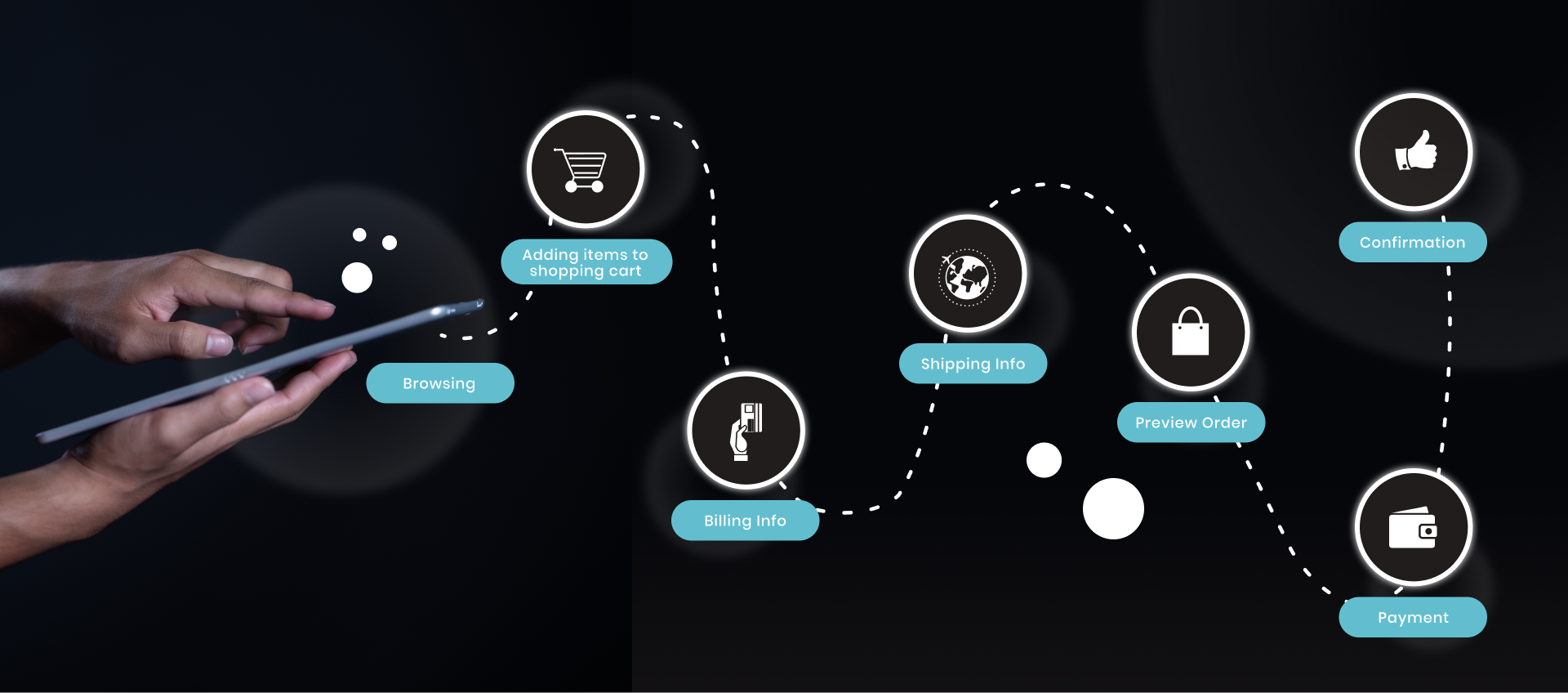
An e-commerce checkout process is the step shoppers follow when buying products online. The process starts when the customer adds products to the shopping cart and ends with the order confirmation on a successful purchase. The best checkout is a frictionless user experience. Every e-commerce checkouts, irrespective of the industry they serve., follow the same process. It is as follows:
product added to the cart → Checkout initiation → Entering customer & Billing information → Add Shipping details → Preview Order → Payment processing → Order Confirmation.
Downloadable products don’t need shipping information, and once the shoppers get the confirmation, merchants start the order fulfillment.

What are the reasons Shoppers leave the checkout page?
Checkout is the most sensitive part of every buying process and even more challenging for developers when any complex steps are involved! The Study Shows cart abandonment rates are nearly 70%, 60%, and 55% in the USA, UK, and Europe, respectively.
Merchants are investing heavily in digital marketing and driving traffic to online stores, and it feels tragic if your hard-earned leads would vanish if they find any of the following things! If your checkout and cart abandonment rate is high, listed are the reasons they are walking away:
- Performance issues: The most challenging part for every e-commerce business owner is maintaining the website's performance and speed. If the site performs poorly, shoppers flash away!
- Forced account creation: Visitors and shoppers, if they are buying for the first time, may hesitate to follow an extra step for creating an account. If your website forces the users to create an account compulsively, they may leave the store.
- Unexpected Changes: Costs added at the checkout, such as shipping, service charges, taxes, and other hidden costs that differ from the product price, make shoppers second guess before buying.
- Long and complex checkouts: Customers love hassle-free checkouts and want to buy things and move! If you add any complex steps in between, you know what it costs you.
- Lack of payment options: Customers are used to specific payment options, and not providing them with their convenience may lead them away from your online website.
More checkout optimization can be done gradually by understanding your business industry, domain, and markert you sell. If you want to understand the root cause, We hear you! Now, let’s dig into some best e-commerce checkout practices to follow.
E-commerce checkout best practices
"An ounce of prevention is worth a pound of cure" - it's better to address the root cause of a problem before it becomes a bigger issue that requires more effort to fix. Let's see the best practices for checkout improvement and optimization and have a frictionless shopping experience.
Show all the cost upfront
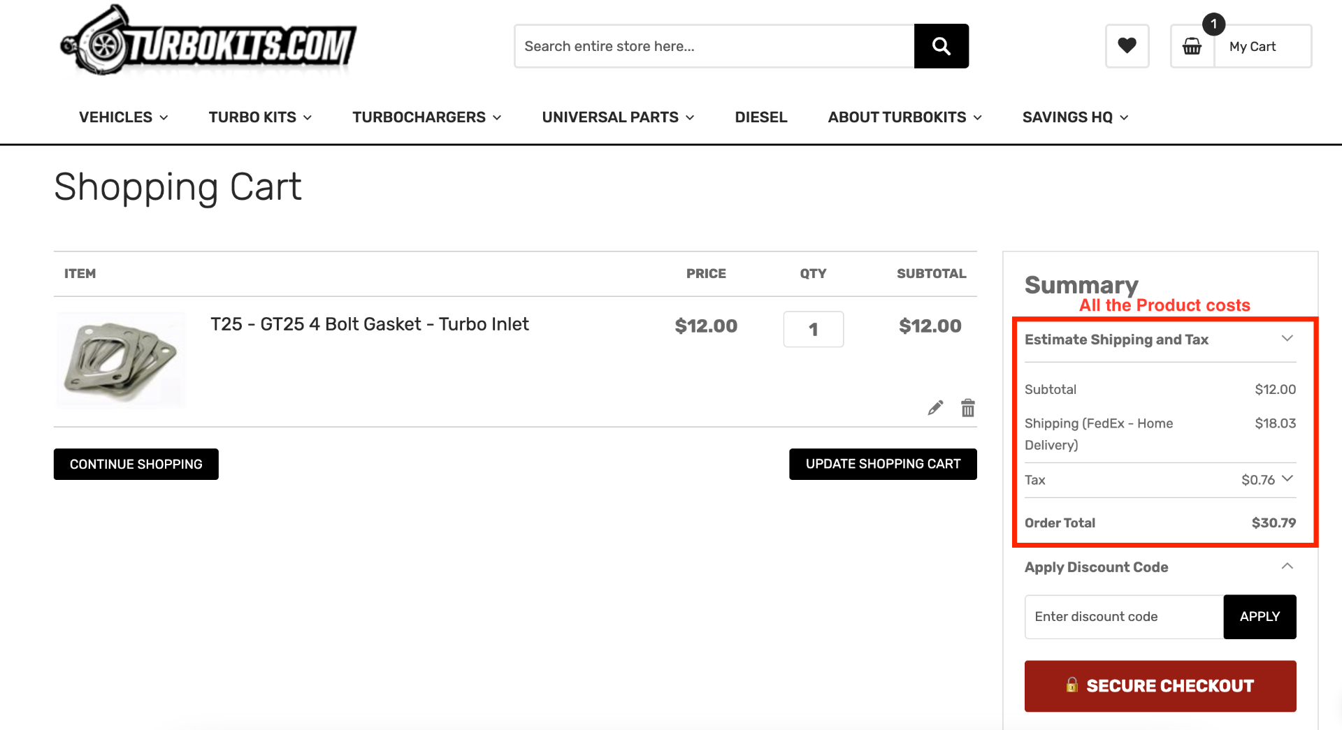
To ensure a smooth shopping experience, displaying all costs upfront is important. Depending on the industry and product, these costs may include taxes, shipping charges, and gifting charges. By doing so, customers can see the total cost of the product before making a purchase, which helps to prevent any surprises that could lead to cart abandonment. Remember that customers are not willing to pay extra fees upon order confirmation. To avoid this, it is recommended to list all applicable costs clearly and concisely, such as item cost, shipping charges, taxes, and the total amount.

show progress with the process
Displaying the progress of the shopping experience is a proven method to prevent cart abandonment. This feature empowers customers by allowing them to keep track of their progress and understand what steps they have completed and what's left to do before completing their purchase. By providing an estimated time frame for completing the transaction and serving as a helpful guide throughout the process, this feature significantly improves the overall user experience.
make applying discounts visible and easy to find
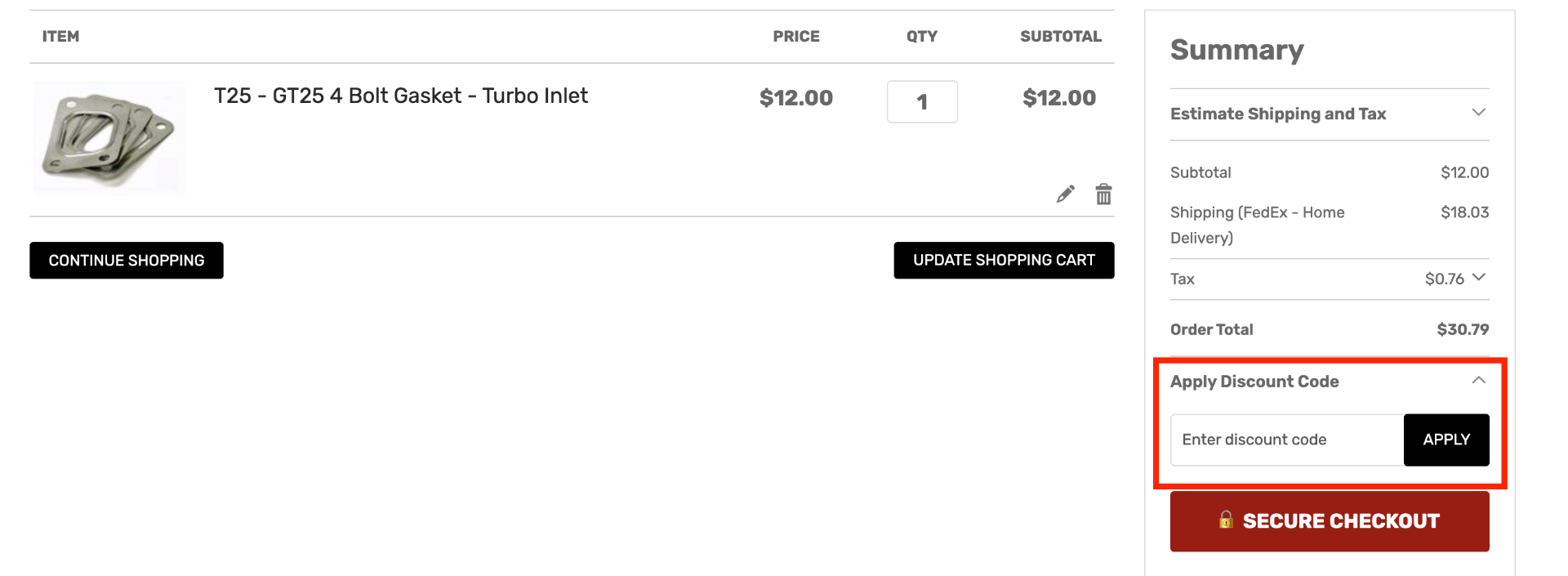
Discounts and coupon codes are a common strategy for merchants to attract customers. If you have any promotional codes or discounts, make them visible and straightforward to apply at checkouts. Put coupon code boxes clearly visible so that customers can redeem them. More often, merchants must be careful with a promo or coupon codes as shoppers who do not have them return searching for a discount code. If they don't find any, they will check out, and hence it will impact the cart abandonment rate. Check out the example below to see how to place the coupon code box!

Guest checkout or Express checkouts are a savior.
Offering guest checkout as an option can be a great way to prevent customers from abandoning their shopping carts. By providing this feature, shoppers can complete their purchase without sharing their personal information or creating an account on your website. Check out the example below to learn more about how this can work for you.
One-step or express checkout is a game-changer for your loyal or returning customers. Not only does it make the checkout process faster and more convenient, but it also allows customers to quickly and easily fill in their details during the purchase. If you're interested in implementing this feature, look at the example of a store that offers express checkout to see how it can benefit your business.
Create a sense of urgency
Hesitation leads shoppers to move to the competitor's website and increases abandonment rates. By creating a sense of urgency, shoppers quickly do the checkout to get the products that are part of the promotions. Creating a sense of urgency means "Limited period offer," "Free delivery till midnight," "Next Day Delivery," "40 customers have this in their cart", "only two in stock," and many more. Such prominently displayed offers will make shoppers confirm their orders quickly!

Provide accessibility
No matter what, your website should be easy to access, regardless of shoppers' ability. It is the key to the best user experience; thus, checkout must be optimized for accessibility. Many shoppers are specially-abled and need tools to navigate the website and buy products. Keeping them in mind will allow merchants to design the checkout process and create hassle-free checkouts that boost conversion rates. Kindly implement the following things:
- Tag elements properly to support readability with all screen types
- using high-contrast colors for CTA's and similar feature leads to standing out on the entire page
- CTA texts should be clearly visible and easy to explain
allow language change options
E-commerce is not limited to domestic shoppers; many brands sell to international markets. If you think selling locally and internationally is the same, stop here! International shoppers don't progress if the stores are not personalized. Many international shoppers leave just because they prefer to shop in their own language. Allowing multi-language with enabling location change will help merchants retaininternational shoppers and reduce cart abandonment rate.
Make checkout mobile-friendly
Statistics for 2023 show that 80% of shoppers have used their mobile phones to look for products, reviews, and price comparisons instead of going to a physical store. In the last six months, 79% of mobile users have purchased using their phones.
These high percentages of mobile shoppers directly drive attention. Not optimizing the mobile checkout process means leaving money on the table!
To resolve this:
1. Ensure clear and readable CTAs for mobile shoppers.
2. Make the website in a responsive manner and test every CTAs and functionality for mobile devices and tablets.See the example below.
Display trust marks
Shoppers always look for trust factors, especially when buying for the first time. Merchants have to show the trust factors that help shoppers gain trust and make their purchases! They will instantly leave the website if they see any suspicious things or hint about the website they found. Shoppers are fearful of losing their money or getting poor-quality products.
Having trust marks lead to reassurance about the products and support from the online store. Incorporate trust marks such as:
- Customer reviews
- SSL Certification
- Trust Badges
- Clearly Shown contact details
Be support ready
The common reason shoppers abandon checkout is the need for more support from the merchants. There's a case where shoppers need extra information or want to contact the representative over a call/chat/mail. They stay in the store if they get support on an immediate and priority base.
This situation may happen when customers are looking for more specific product details or want personalized products. Encourage shoppers to use live chat and emails for support. Support helps shoppers with that extra push to finish the checkout. Targeting abandoned cart users with the additional backing make them complete the checkout process.
ECommerce Checkout Summary
E-commerce checkout is the process that every shopper follows when buying products online. It is the most sensitive stage of any online store as it determines the actual buyers from all the visitors. Cart abandonment is the problem that hinders the checkout process from getting complete. These factors are hidden costs, forced account creation, insufficient payment options, language barriers, etc.
Continuously optimization of the checkout process is essential to generate more sales. Focusing on the checkout optimization strategies will lead to a seamless checkout experience for shoppers.
If you have any questions and want to optimize your checkout or an entire website, we hear you! Drop us an email at info@navigatecommerce.com and get a free consultation!

